
I have fallen victim to the seductive nature of clothing of a certain color or print. Sometimes the fashion magazines are guiding my hand, sometimes I just love a color. The end result is often the same, a statement garment that does not play well with the rest of the closet. So Sarai invited us to think about colors and about patterns & prints and narrow down that list of temptations to the options that flatter and coordinate.
Colors
Last week I wore gray trousers, a black blouse, red shoes, a red cardigan and a gold

necklace with white fabric flowers to work. (I received one comment on the necklace and two comments on the red color.) I joked that red was my power color, which was not always true. Despite red being an important color in Chinese culture, I shied away from it. It was a bold color that drew attention and for a long time I was content to avoid attention.
It was also a color that I associated with effort. At one point in my childhood I remember many red clothes being stained with blue smudges of something in the washing machine. Our family didn’t wear much red after that. I got it in my head that wearing red was a chore – I had to be careful of blues staining the red and about red staining lighter fabrics. I preferred low-maintenance clothing. Easy to wear, easy to wash.
Let’s consider my color story. Which colors do I gravitate toward? How do certain colors make me feel? Color is a symbolic language, one that is influenced by culture, religion, age, and geographic location. The same things I was asked about in week 1.
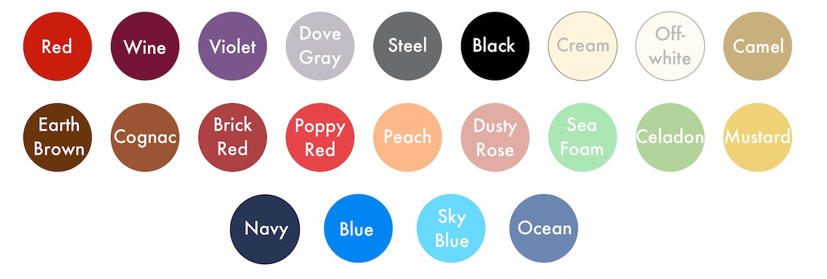
I ascribed colors to the personal style words from week 1. I reviewed my Pinterest Board(s) for colors I was frequently drawn toward. And I looked at what colors most frequently appear in my outfits and did some free association exercises. I identified 22 colors for my palette. (These colors will be the set I work from to create smaller seasonal palettes.)
When we are first learning the color wheel as children, we are told that certain colors (red and green) don’t look good together because they are complimentary colors. When we get older, especially for those of us who take an interest in art class or fashion, we learn about hues and shades and discover that that “near” complimentary colors (forest green and a faded pink) look quite good together. Eventually we observe that the highest caliber of artists and fashion designers take the color wheel and break all the “rules” we once learned.
The above palette can be broken down into slightly more digestible bites:

The concept of “near neutrals” was new to me, but it explains why your blue jeans coordinate with so many outfits. My current wardrobe has a lot of statement colors that don’t interchange and too many neutrals in too many garment types. There are mornings where my only option is a light gray blouse, gray cardigan, and dark gray or camel pants. Those monochrome outfits can be interesting, but not all the time.
Patterns
I honestly didn’t spend as much time pouring over prints. A lot of my wardrobe is solid color, but I do enjoy a print or pattern that is small, geometric or natural, and doesn’t include too many colors. I like small polka dots on a blouse, herringbone trousers, small red flowers on a cream blouse, or thin stripes. You can see some of the prints already in my wardrobe. I anticipate that these preferences will come into play as ways to add some of the statement colors unobtrusively into a seasonal wardrobe.

Next Steps: Selecting the style & palate of the fall/winter wardrobe
All of these vague ideas about shapes, colors, and prints need to be turned into something tangible. It is time to focus on the chilly, rainy fall and winter weather. Time to consider what pieces I already have, what I can sew, and what I should just buy or add to my holiday wish-list.
Oh, and about that fear of red… This past summer my wedding dress was made out of a vibrant red taffeta. 🙂


I enjoyed reading about your bit of fashion self-discovery. And your wedding dress is beautiful – you look gorgeous in it! I’d love to see a whole post just about your wedding dress. =)
Thank you. I’ll be writing more about my wedding dress before the end of the year. 🙂